by Trevor Rocious
Over the years, we've seen series of typefaces displayed on magazines, sign posts, brochures, flyers, newspapers and even digital platforms such as electronic billboards. Fonts have become an integral part of graphics design and typography.
Contents
Writers and Graphics Designers choose fonts to work with based on personal assessment of its meaning, historical value and aesthetic qualities. Choosing the right font for your write-ups and designs is very crucial in our world today.
Just like fashion, designers come up with styles that will make people look good and presentable - Same approach can be applied to graphics design. You have to make use of the right font to make your work look beautiful and presentable.
In this guide, readers will get to learn about the most popular and best fonts of all time. This will help you to make a good decision when choosing a font for articles, printing, web design, logo design or paper publishing.
In no particular order, here are the most popular fonts of all time;
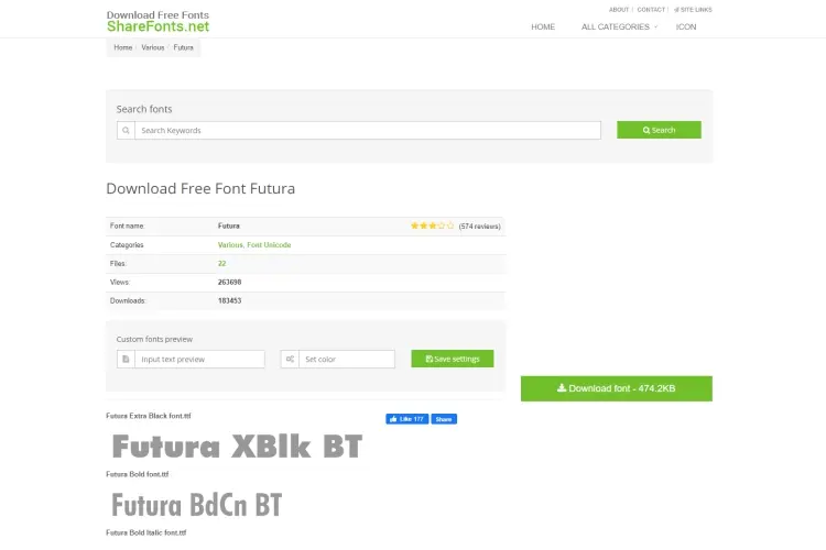
This is one of the most popular fonts of all time. It has a rich history because it is the benchmark for most geo sans serifs for the past few decades.
Futura was designed in Germany by Paul Renner in the late 1920s.
One unique feature of Futura font is its remarkable shape. In today's generation, it is mostly used for business advertising and a major automobile brand such as Volkswagen used it as its headline font for years.
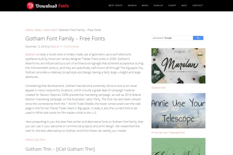
Gotham is a popular font that belongs to the " geometric sans-serif " family of typefaces. This modern typeface was released in the year 2000 by Hoefler and Tobias Frere-Jones. The name Gotham was derived from the word " Gothic " an adaptation of the 20th American Sign and the clean design was inspired by the lettering on New York City architectural design.
Over the last decade these font has been popularly used by designers across the world. There is also a general assumption that the typeface is probably Barack Obama's favorite font - a myth (as I will prefer to call it) that was deducted from its use during the " Obama Campaign " of 2008 Presidential Election.
It's clean and modern appearance makes it one of the most used font.
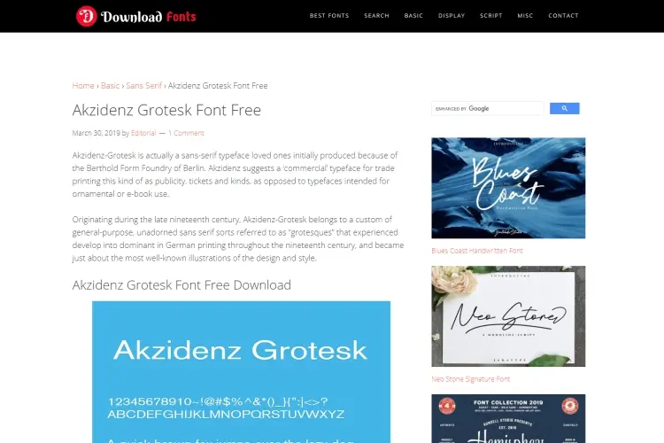
This is one of the best font ever released when you put into consideration its design. It was first released in 1896 by Berthold Type Foundry and later modified with a wider range of variants and weights by Gunter Lange in the 1950s. It has since influenced a wide range of other fonts such as Frutiger and Helvetica .
This German typeface is quite unique due to its neutrality, which gives designers and artists a certain level of flexibility and freedom when designing.
The elegance and versatility of Akzidenz font makes it stand out of the pack.
Garamond font was originally designed in the 15th Century by Claude Garamond during the French Renaissance. At that time Claude was Antoine's apprentice, a publisher who guided him to cut a unique " cicero typeface " for a famous printer named Robert Estienne. A Swiss printer named Jean modified the font in the 16th Century and series of digital versions have since been released over the years. A common version today is the Adobe Garamond.
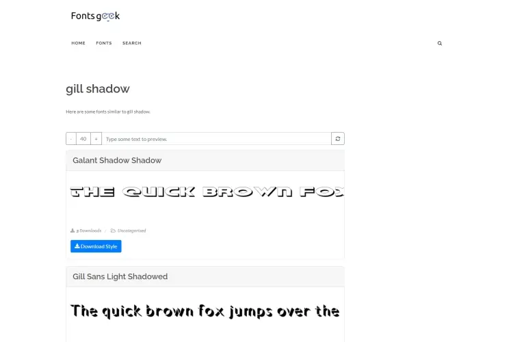
This font was designed by Eric Gill in 1928 and it was inspired by a typeface specially designed for the London underground. Edward Johnston worked with Eric Gill to design a typeface whose characters are quite distinct and legible.
This English produced typeface is one of the best and it is used by major brands and corporations. A notable example is the British Broadcasting Corporation.
Another popular font that deserves recognition is Bodoni. This font was designed in the late 17th Century by Giambattista Bodoni at the palace of "Duke Ferdinand of Bourbon-Parma". The exquisite craft of Bodoni led Duke Ferdinand to give him permission to build a private printing office in the palace.
The weights of this font was modified by Morris Fuller in the early 90s and it was famously used for the posters of the " Goodfellas " movie.
Helvetica is up there as one of the best fonts of all time. Every man and his dog knows this amazing typeface. You can say it is probably the most famous font.
This typeface was designed by Max Miedinger as Swiss designer in the late 1950s. It has a simple modern design look that makes it presentable for any function.
Helvetica is very classic and is widely used in different industries across the globe.
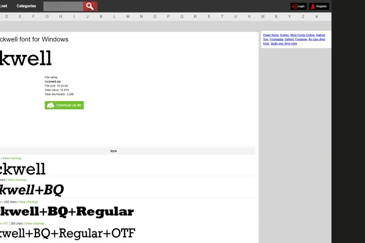
Rockwell was designed in 1934 by the Monotype Foundry In-House Department. This " slab serif " font has its serifs similar in weight to the letter strokes and mainly used for display. Rockwell has a distinct sculptural and geometric shape that adds personality to most designs and make their appearance look of high quality.
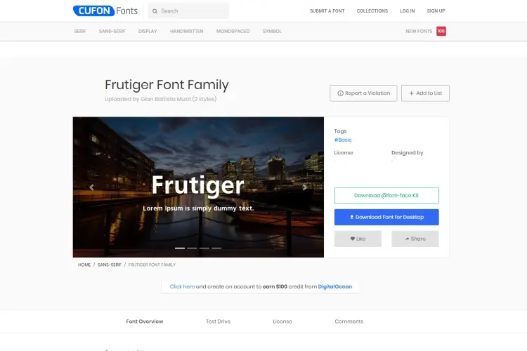
Adrian Frutiger a famous graphics designer developed a classic typeface in 1977 known as Frutiger. This font was used for an airport signage in Paris some years ago due to its unique geometric form. In the late 1950s, Adrian designed a typeface known as " univers ", a more compact font. However, it is not widely embraced like the modern styled Frutiger.
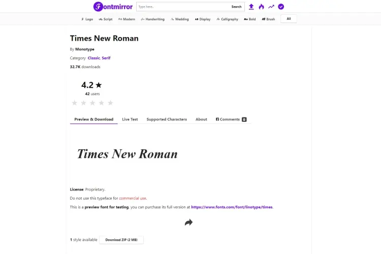
Times is one of my favorite font of all time. Stanley Morison, a typeface designer redesigned a new typeface for "The Times" - a London daily newspaper back in the early 1930s. His work was greatly admired by William Lints-Smith who was the manager at the time.
Stanley gave the London daily newspaper a new and fresh typeface known as the " Times New Roman ". Today, this font has become one of the most used font for writing and publishing across the world.
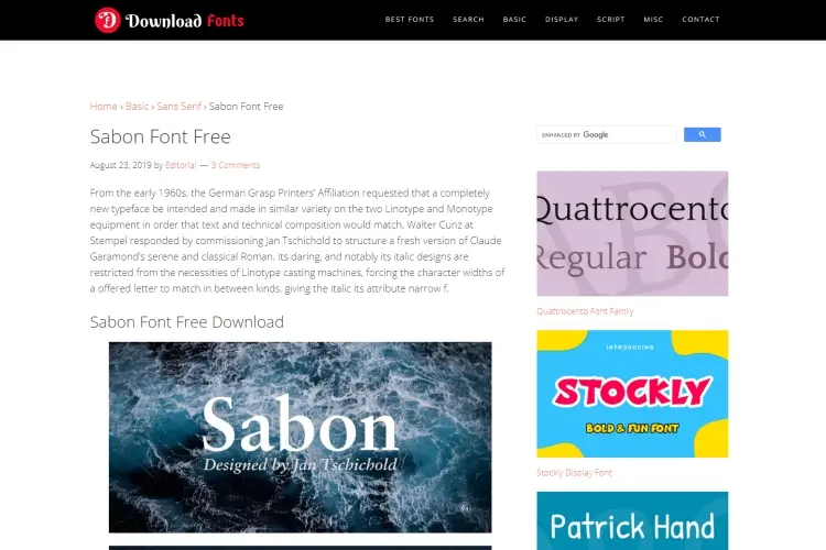
This font was designed by the pioneer of modern graphics design. A Swiss known as Jan Tschichold made his mark in the world of graphics design when he was working in England as a designer at Penguin Books back in the late 1940s.
Jan designed series of fonts but the " Sabon Serif " was exceptional. Today, the font is extensively used across the world due to its unique bold and italic weights. It is a beautiful font and its semi sharp edges and cursive makes it look great.
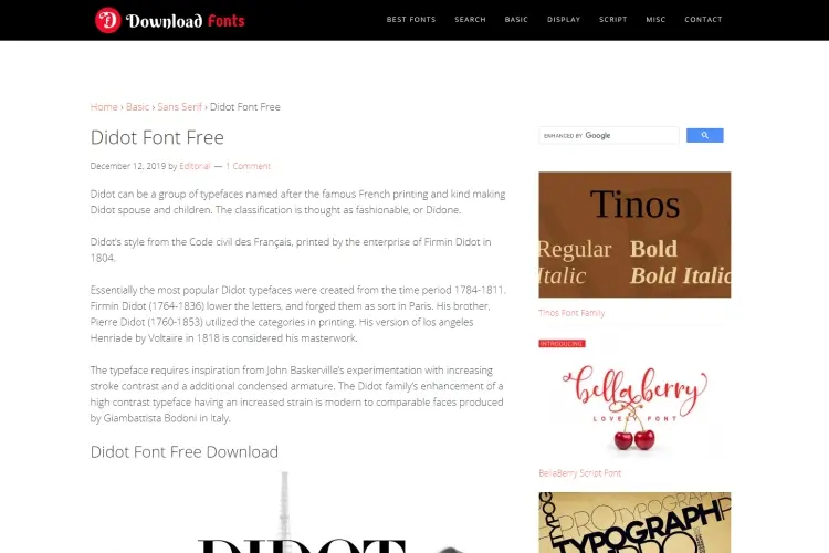
Didot was released in the 18th Century as an alternative to the popular Bodoni font. It is quite similar to Bodoni but its timeless elegance and high contrast strokes makes it unique. It is widely used for many modern graphics work.
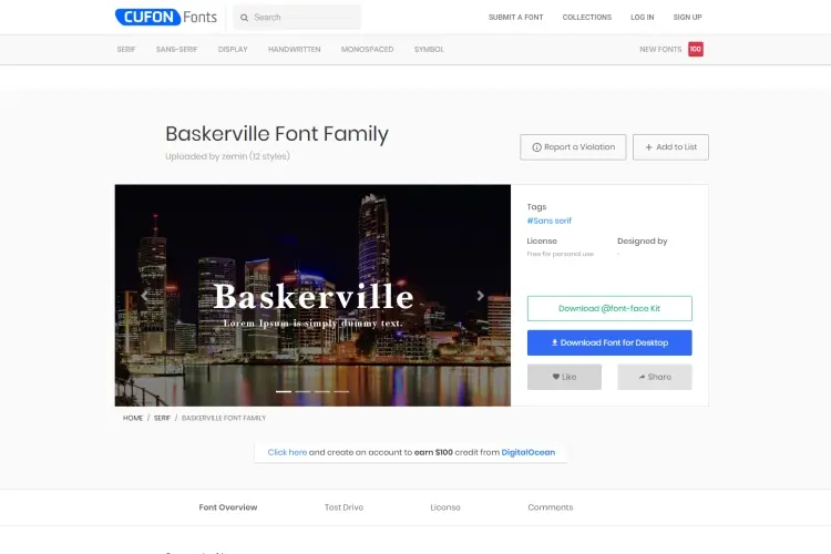
In the early 1750s, John Baskerville wasn't entirely impressed by the old style " Caslon typefaces " available at the time and that inspired him to work on designing a new typeface. Baskerville was officially released in 1757 in Birmingham city as a transitional modern style typeface. Several versions have been produced over the years by different foundries. This font looks so elegant.
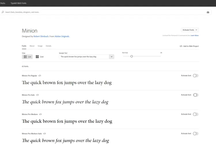
Robert Slimbach designed a distinct typeface when working on Adobe Garamond.
This distinct typeface is known as the minion and it was released in the late 90s.
Robert gathered several prints from museums across Europe and made good use of the ideas to create the unique Minion font. He also made use of literatures on Renaissance fonts to make Minion a quality typeface.
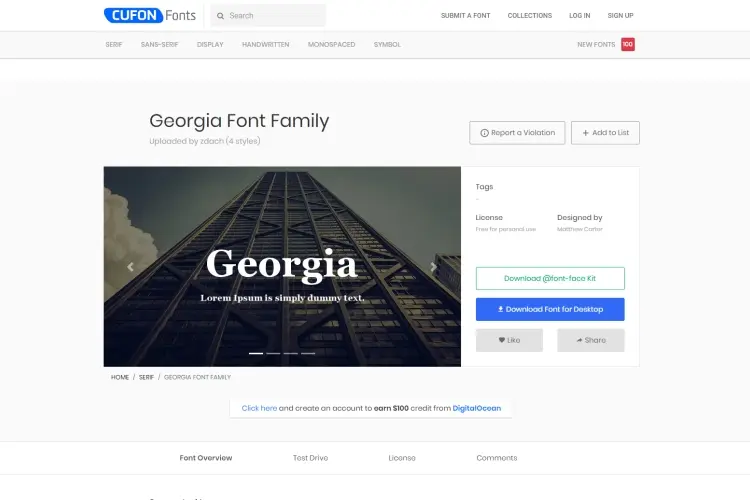
This is a modern style typeface that was created by Matthew Carter in 1993.
Georgia was designed for the Microsoft Font Collection and it gained a whole lot of recognition for its simplicity and legibility. I personally love this typeface and it is best used for low resolution screens because of its clear appearance.
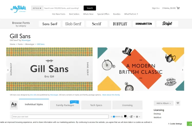
The final font on our list is Gill Sans. This font was designed in 1928 by the famous Eric Gill and produced by the Monotype Corporation. It is an English font and arguably the most legible sans serif typeface you'll ever see. Edward Johnston also worked with Eric Gill to ensure this the Gill Sans makes a unique difference.
Many designers across the world now make use of the "Gill Sans" fonts to bring out the quality of their design. There are also loads of font weights and variants.
There are hundreds of fonts available at your disposal and if you dig deep, you'll find amazing fonts that are perfect for your printing and digital designs. While the options are endless, we've carefully selected the most popular fonts of all time.

Make sure you study this guide for better understanding and also visit the links to learn more about each of the fonts listed. Hope you enjoyed reading the article.
Kindly share a list of your favorite fonts in the comment section.

About Trevor Rocious
Trevor Rocious is a prominent science blogger known for his engaging and informative content in the field of scientific exploration and discovery. With a passion for unraveling the mysteries of the universe, Trevor has captivated a wide audience with his ability to communicate complex scientific concepts in a relatable and accessible manner.
 |
 |
 |
 |
Great Science Topics
Come here for FREE Gifts. We want to share some nice tips and great tricks. First, disable your adblocker for them
Once done, hit anything below
|
|
|
|
 NationalTechCenter